Delicious snacks for the ardent carnivore
Strategy / Naming / Branding / Print / Packaging / Illustration
Team:
Jasmine Arora, Siddharth Thorat, Rohnit Rehani, Aradhana Rawat, Sachin Bhatt, Hanumant Khanna
Chicken Chips video by Doki
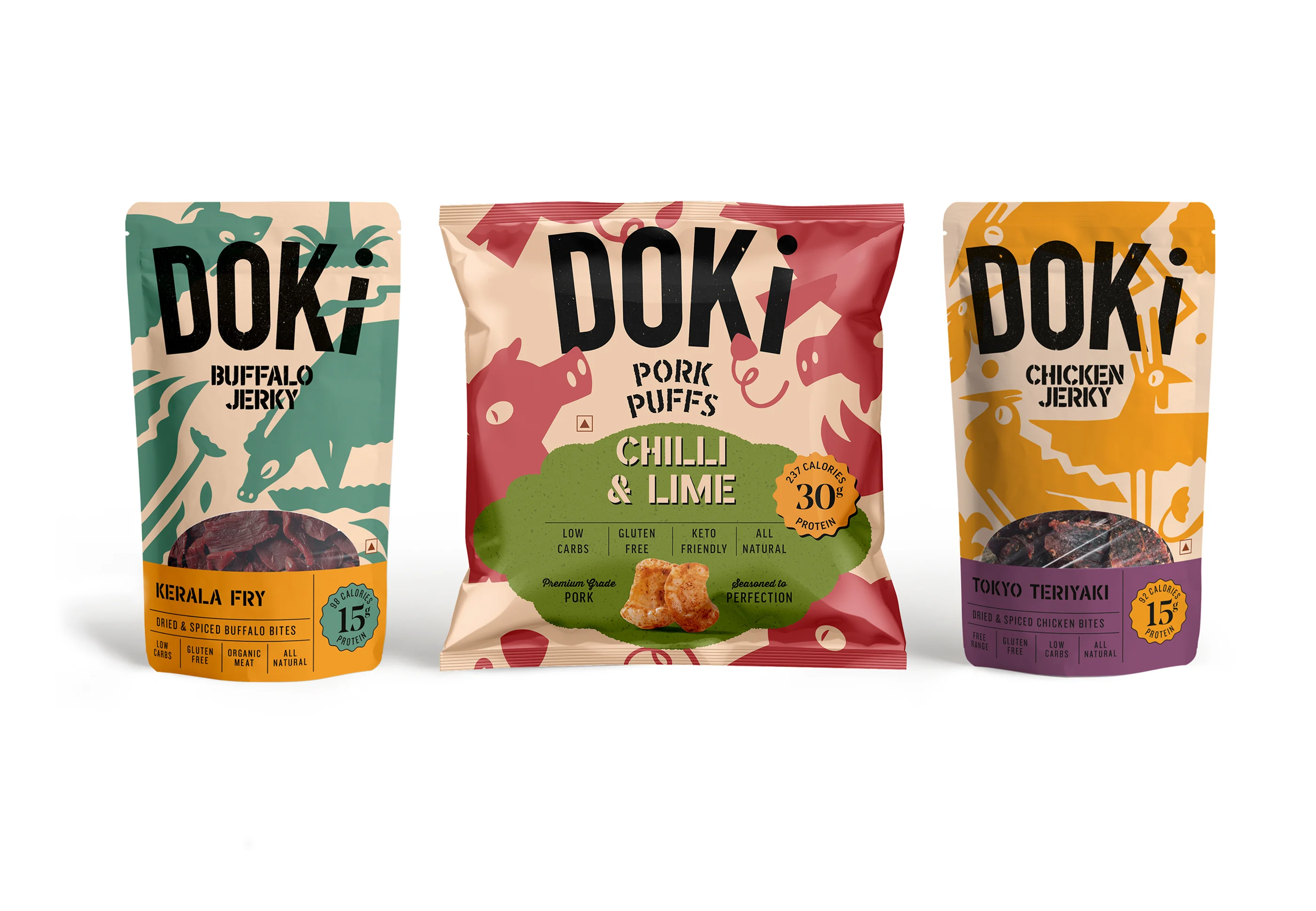
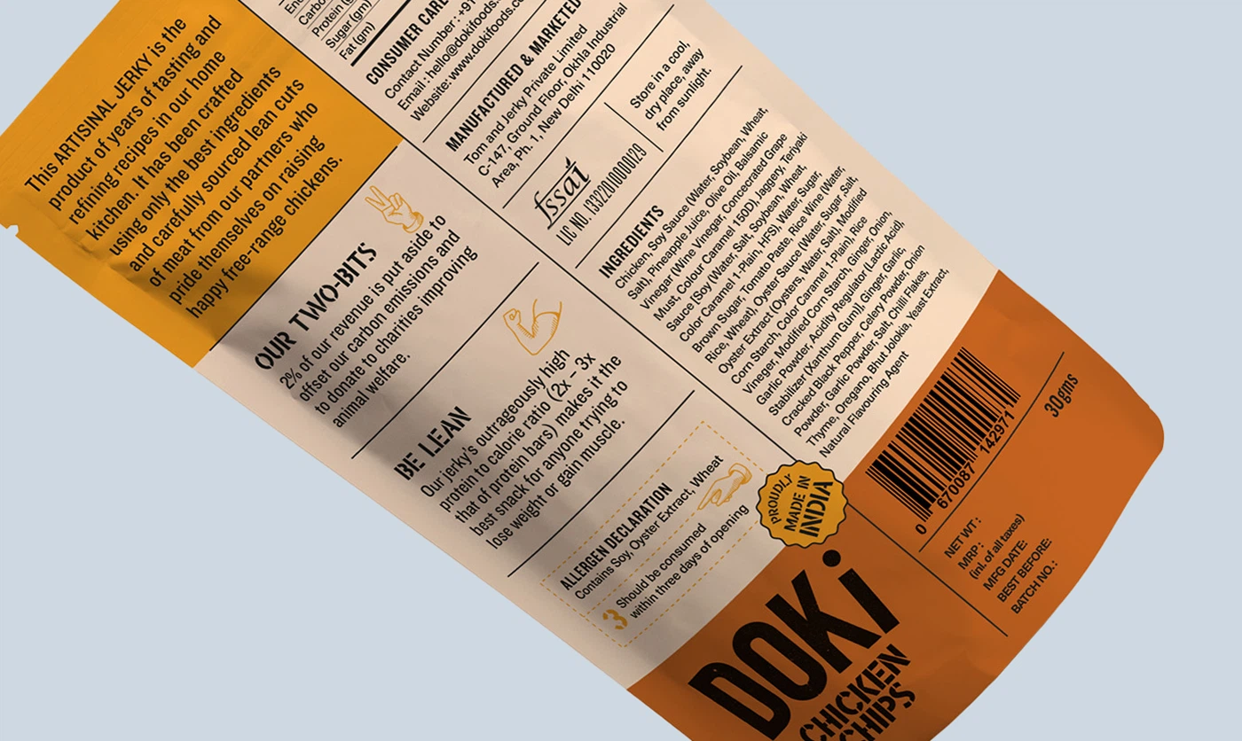
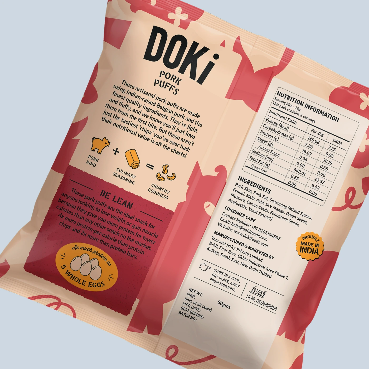
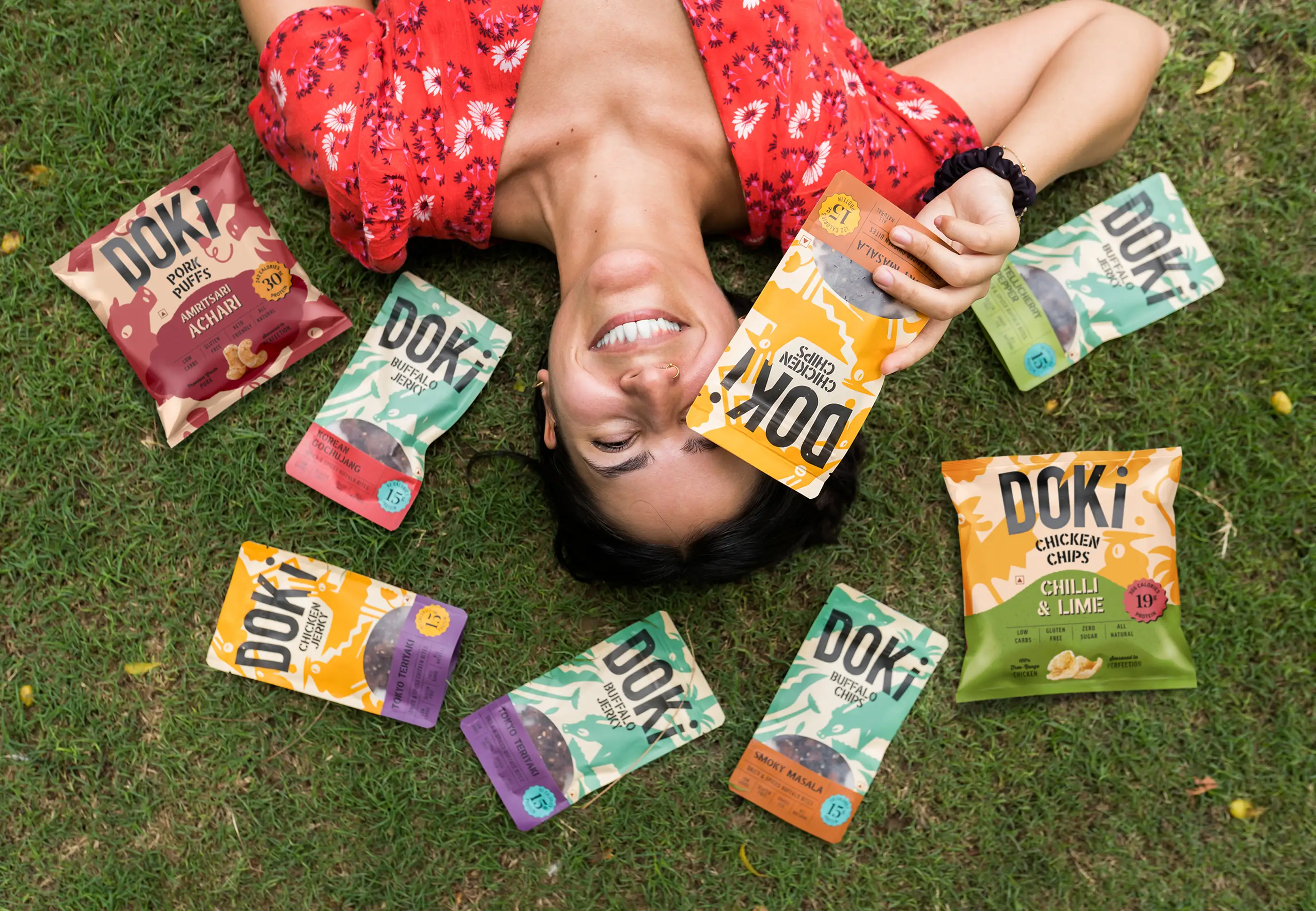
The Brand: Doki is a range of dried and spiced packaged meats, the first of its kind launched in India. While formats such as jerky and biltong are well established globally, Doki reinterprets dried meats for Indian consumers through familiar proteins and an assortment of local and international flavours to suit every palate. The range is designed to broaden adoption, positioning dried meats as a versatile, high-protein snack rather than a novelty.
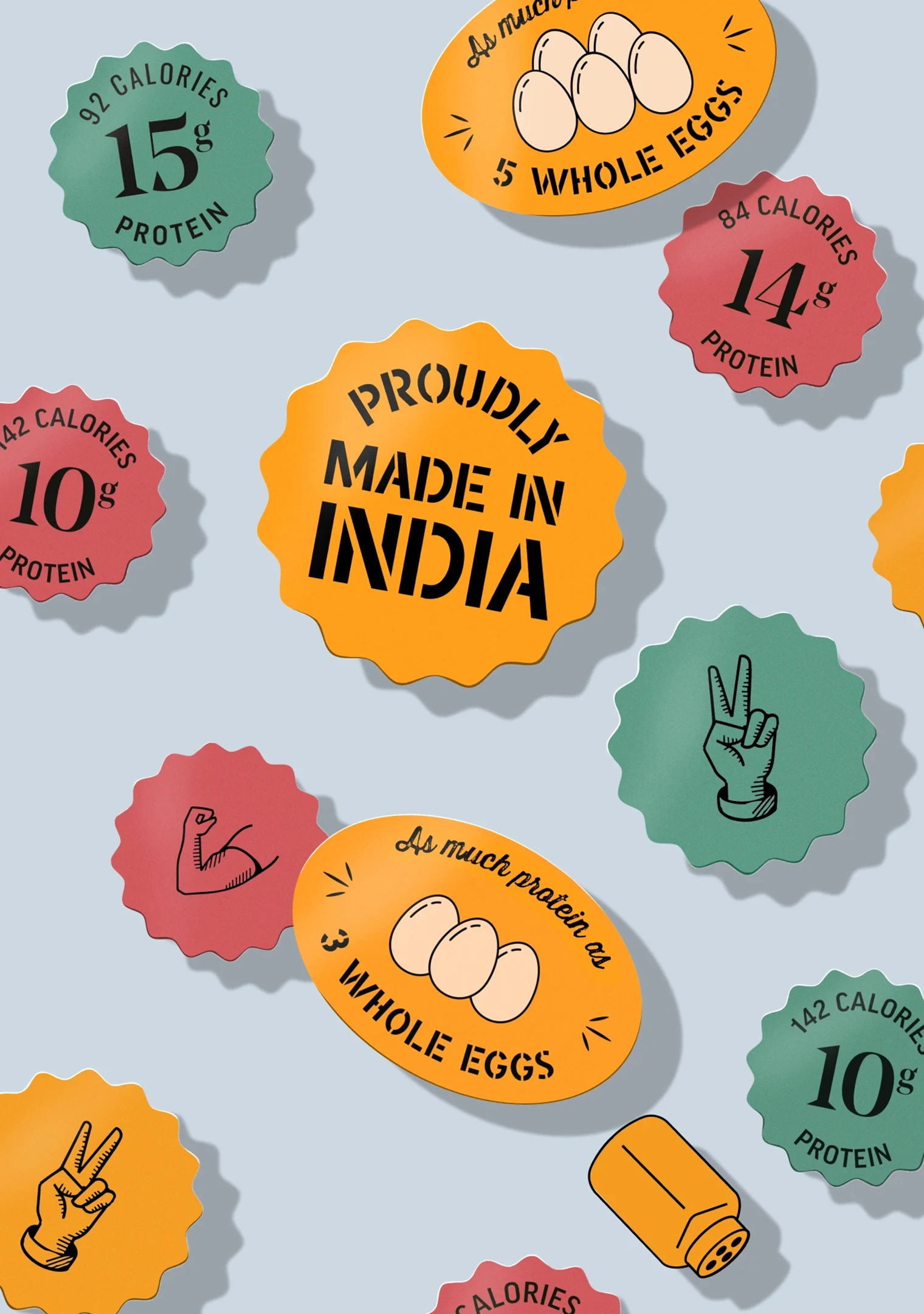
Design: Being the first player in the market, designing the brand and packaging gave us the freedom to create an entirely new visual language, not limited by category expectations. Consciously staying away from the 'wild west' theme of most jerky packaging outside India, Doki establishes its own bright and fun take on delicious meat snacks with a focus on nutrition, sustainable practices and delicious flavours.

The Chicken Dance
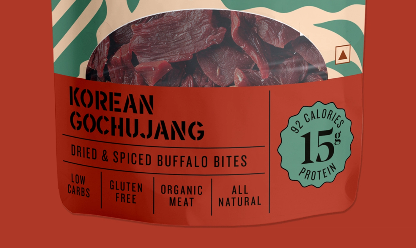
Playful illustrations of chickens, pigs and buffaloes anchor the packaging, clearly signalling the core
ingredient without tipping into the macabre. Designed as characters rather than icons, they offer strong
potential for animation and future extensions across formats and variants.
Bold use of colour drives instant differentiation between meats and flavours, ensuring high shelf visibility and quick recognition. A series of icons and badges clearly call out nutritional information, promoting the product as a healthy snack.